By White Stone Real Estate
Color does more than decorate a space; it quietly influences how a home feels and how people move through it. We work with homeowners in Hot Springs who want their homes to feel comfortable, intentional, and aligned with their day-to-day lives. Paint choices often seem simple at first, but the impact they have on energy, focus, and relaxation is significant. When color decisions are made with purpose, a home can feel more cohesive without requiring major changes.
Key Takeaways
-
Color affects mood, scale, and daily comfort
-
Light and function should guide paint choices
-
Thoughtful color use supports long-term livability
Start With How Each Room Is Used
Matching color to daily function
Before selecting a paint shade, it helps to think about what actually happens in each room. Function should lead the decision, not trends.
-
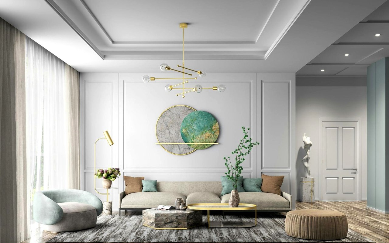
Living areas benefit from balanced, welcoming tones
-
Bedrooms often feel better with softer, calming shades
-
Work or hobby spaces can support focus with deeper hues
In Hot Springs homes, where rooms often serve more than one purpose, choosing color based on use helps spaces adapt more easily over time.
Pay Attention to Natural Light
Letting light guide your palette
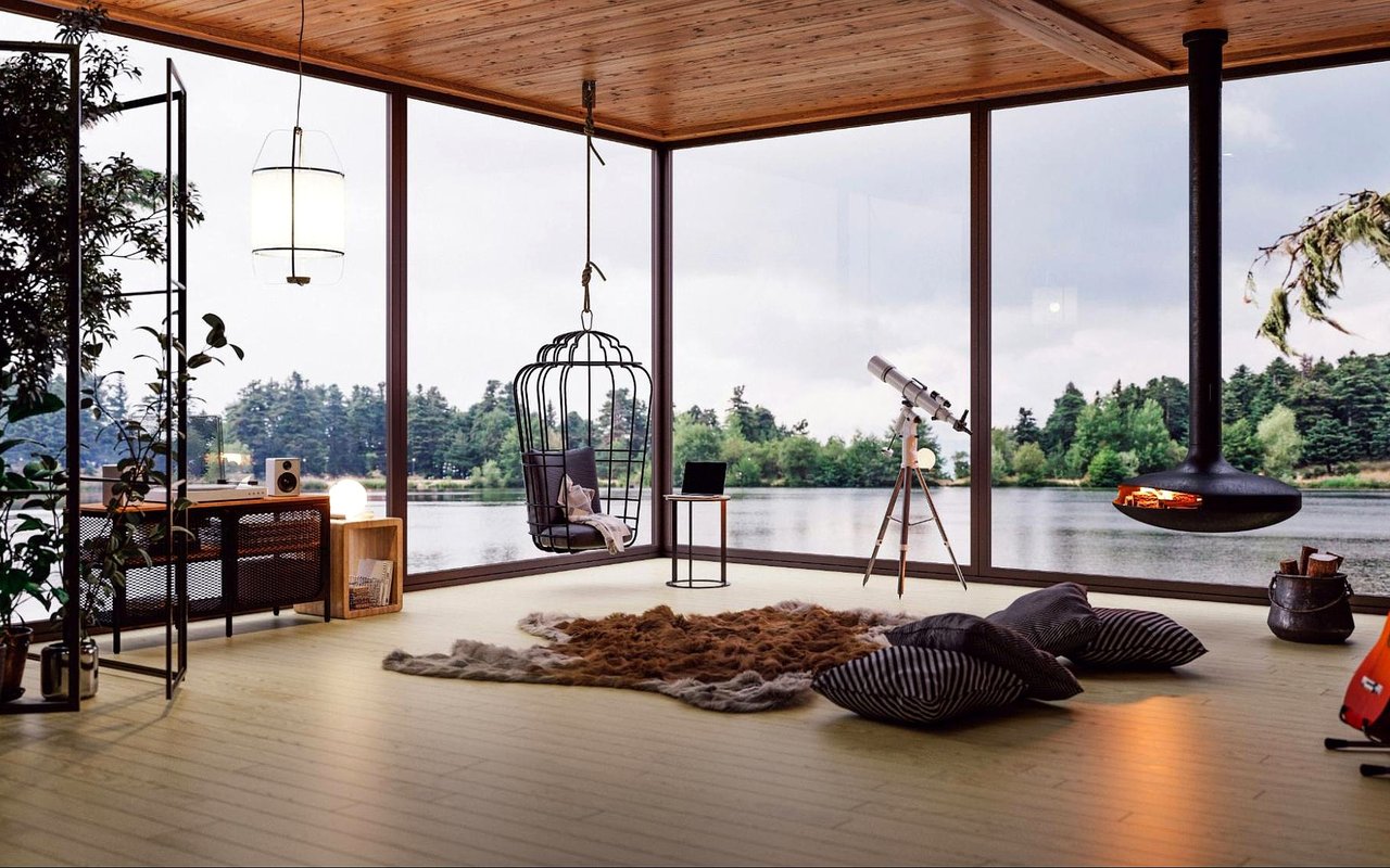
Light changes how color appears, sometimes dramatically. Understanding how sunlight enters a room prevents surprises later.
-
South-facing rooms can handle cooler tones
-
Lower-light spaces often benefit from warmer undertones
-
Paint looks different in morning versus evening light
Homes near areas like Lake Hamilton or with tree-lined lots may experience shifting light throughout the day. Testing color in real conditions helps make sure the result feels balanced rather than heavy or washed out.
Understand Undertones Before Choosing
Why undertones matter more than shade names
Two paints that look similar on a sample card can feel very different once applied. Undertones are what give color its true personality.
-
Warm undertones include beige, yellow, or subtle red
-
Cool undertones lean toward blue, green, or gray
-
Neutral undertones balance warm and cool elements
Undertones should work with existing finishes like flooring, cabinetry, and stone, which are common focal points in Hot Springs homes.
Create Flow Between Connected Spaces
Helping rooms feel cohesive
Color should guide movement through the home rather than interrupt it. Flow matters most in open or semi-open layouts.
-
Use one primary neutral across multiple rooms
-
Shift intensity instead of switching colors completely
-
Repeat accent tones subtly to connect spaces
This approach supports cohesion and helps the home feel larger and more intentional.
Use Color to Influence Perception of Space
Adjusting how rooms feel
Color can subtly change how a room is experienced.
-
Lighter shades make smaller rooms feel more open
-
Darker tones can add depth to larger spaces
-
Vertical color changes can influence perceived ceiling height
Using color intentionally allows homeowners to shape how rooms feel without altering structure.
Kitchens and Gathering Spaces
Supporting energy and connection
Kitchens and dining areas are often the heart of the home, especially in places where entertaining is common.
-
Warm neutrals encourage comfort and conversation
-
Muted colors support longer gatherings
-
Avoid overly stark contrasts that feel harsh
In Hot Springs, where hosting often extends from indoor to outdoor areas, color choices that transition easily help spaces feel connected.
Bedrooms and Private Areas
Encouraging rest and calm
Private spaces benefit from tones that support rest rather than stimulation.
-
Soft blues and greens promote relaxation
-
Muted neutrals feel grounding
-
Avoid overly saturated colors that feel energizing
These choices help bedrooms feel restorative rather than purely decorative.
Accent Colors With Intention
Adding interest without overload
Accent colors work best when used sparingly and with purpose.
-
Highlight architectural features or focal walls
-
Use accents to support, not dominate, the palette
-
Repeat accents elsewhere for balance
Restraint keeps accents feeling layered instead of distracting.
Trim, Ceilings, and Transitions
Completing the color story
Walls aren’t the only surfaces that matter. Trim and ceilings influence how colors interact.
-
Lighter ceilings can make rooms feel taller
-
Consistent trim colors support cohesion
-
Subtle contrast adds definition
These details often elevate the final result without additional cost.
Avoid Trend-Driven Decisions
Choosing longevity over novelty
Trends change quickly, but paint tends to stay longer than expected.
-
Neutral foundations age better
-
Timeless palettes support future flexibility
-
Personal style should still respect the home’s design
Homes that feel current without chasing trends tend to remain appealing longer.
Emotional Impact Matters
How color shapes daily experience
Color influences emotion as much as appearance.
-
Warm tones create comfort and connection
-
Cool tones support calm and focus
-
Balanced neutrals provide flexibility
When homeowners understand color psychology in home design, decisions become more confident and less reactive.
Testing Before Committing
Why samples matter
Paint should always be tested in the actual space.
-
Apply samples to multiple walls
-
Observe throughout the day
-
View alongside furniture and finishes
This step helps avoid costly repainting and ensures the color supports the room as intended.
Long-Term Perspective
Thinking beyond the first impression
Color choices should support how the home will be lived in over time.
-
Consider how needs may change
-
Choose adaptable palettes
-
Focus on comfort, not just appearance
This mindset supports lasting satisfaction.
FAQs
Should every room be a different color?
Not necessarily. Related tones often create better flow and cohesion.
Do darker colors always make rooms feel smaller?
No. When used thoughtfully, darker shades can add depth and warmth.
Is white always the safest option?
White can work well, but undertone and lighting matter just as much as shade.
Bringing Color Choices Together
Color is one of the most effective tools for shaping how a home feels, but it works best when guided by intention. We help homeowners think through how color psychology in home design affects comfort, flow, and everyday living so choices feel purposeful rather than overwhelming. When color supports function and emotion together, the entire home benefits.
If you’re planning updates or refining your interior spaces, start a conversation with White Stone Real Estate to talk through how thoughtful color choices can support comfort, cohesion, and long-term livability in your Hot Springs home.
If you’re planning updates or refining your interior spaces, start a conversation with White Stone Real Estate to talk through how thoughtful color choices can support comfort, cohesion, and long-term livability in your Hot Springs home.


